Dynamic grid:
How to solve UX problems with code

OverviewWhen we converted Asurion's experiences from desktop only to responsive design, we had a lot of issues working globally and at scale. We already had a mature product, and it’s not a matter of just fitting the design to a desktop or tablet. We wanted to make the experience translate to the desktop seamlessly.
The problemFigma has its limitations when working on responsive design, let alone simultaneously converting multiple experiences to responsive design. And adding to that, communicating design decisions in a large corporation at a global scale.
This project is best viewed on desktop

For the best experience, please visit this interactive project on a desktop computer.

This project is best viewed on bigger screens

For the best experience, please resize you browser or visit the project on a desktop computer.

Featured

Enigmatic Oasis Discovered in the Heart of the Sahara Desert!

Mystical Underwater City Unearthed in the Pacific Depths!

Lost Kingdom of Techno-Wizards Found in Remote Himalayan Mountains!

Parallel Universe Gateway Detected in Antarctica's Icy Wilderness!

Ancient Forest Guardians Awaken in the Heart of the Amazon!

Mysterious Monoliths Emerge from the Sands of the Arabian Desert!

Hidden Civilization Thrives Inside a Dormant Volcano in the Andes!

Reviews
Joan R.Portland, Oregon

I never knew music could transport me like this! 'Ethereal Journeys' took me on a sonic adventure unlike anything I've experienced. It's an absolute masterpiece!

Jane S.Edinburgh, Scotland

Twilight Echoes' 'Midnight Mirage' is a surreal trip into another realm. The melodies linger in your mind long after the music stops. Mesmerizing and enchanting!

Artists
Ethereal Whispers
Stellar Harmony
Mystique Muse
Seraphic Soundscape
Solar Symphony
Arcane Alchemy
Twilight Echoes
Lunar Lullaby
Celestial Chords
Galactic Groove
Nebula Notes
Astral Aria
Echoes of Eternity
Harmonic Horizon

Why I left Figma and started creating POCs with code?
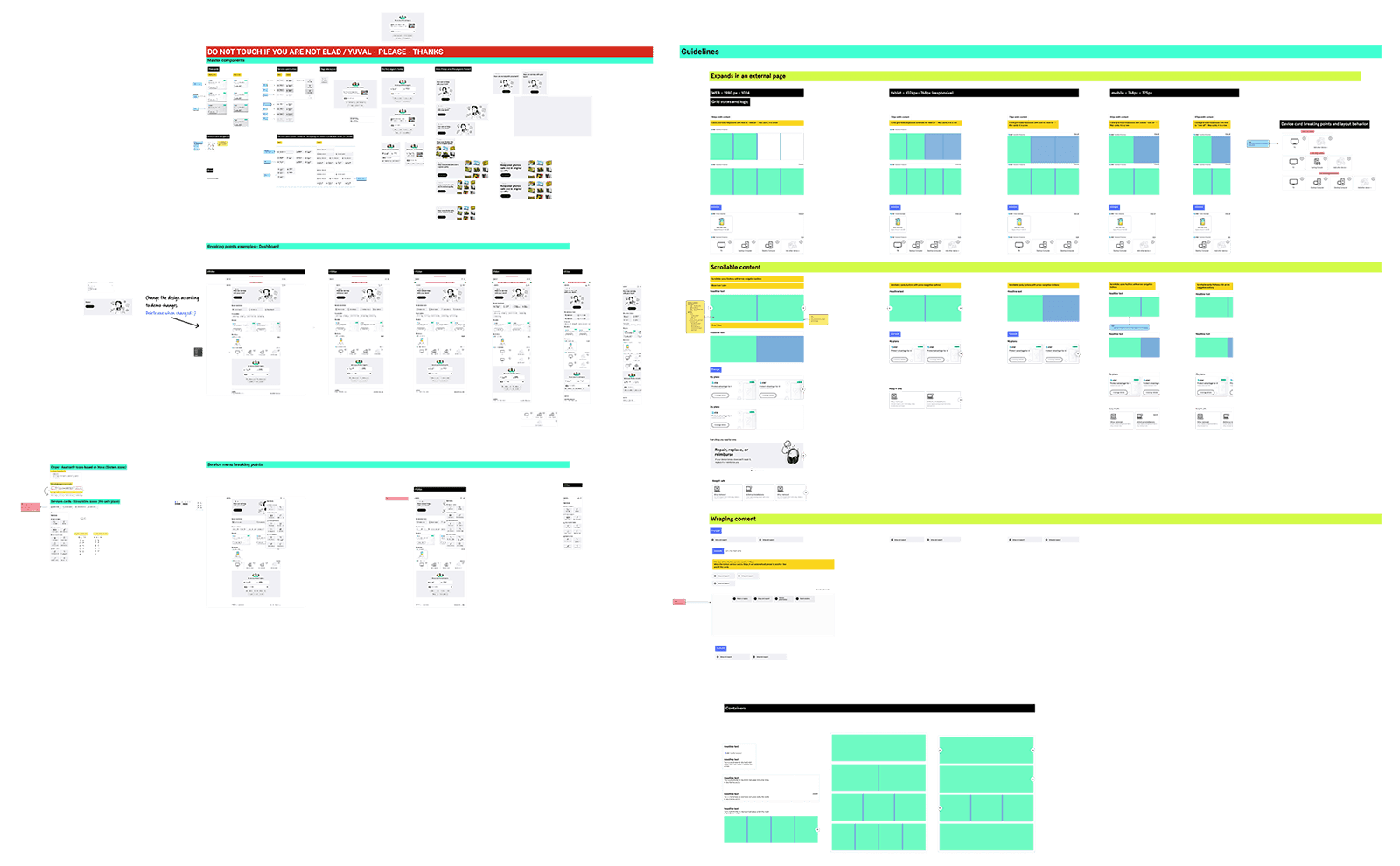
While CSS & JavaScript have many features for handling responsive design, Figma only has a few, and even those are limited. Communicating and creating flexible solutions can be challenging on Figma and sometimes even feel impossible.
A simple Figma file becomes a series of canvases for every breakpoint, with notes on every change. Files like these are hard to create, maintain, and communicate over time.

Making a dynamic grid with no breakpoints

Instead of forcing Figma to do what it can’t, I started making fast proof-of-concept components that the design team could see, discuss, and change quickly on the go.
One example that reflects this the most is the Dynamic Grid (aka ✨Magic Grid✨) component.

Deciding on MVP features

Now, we can solidify the MVP rules. We decided that these features fit our needs and cover most of our use cases.

Minimum element width

Setting a minimum width for components is a straightforward way to maintain their visibility in the grid layout. The grid will automatically adjust, ensuring the elements inside aren't broken.
Even in a small layout, each element is given enough space. The minimum width controls things from becoming too tiny and maintaining their visibility, empowering you to dictate when the grid should break.
Try playing with it:Minimum width: 192px

Enigmatic Oasis Discovered in the Heart of the Sahara Desert!

Enigmatic Oasis Discovered in the Heart of the Sahara Desert!

Mystical Underwater City Unearthed in the Pacific Depths!

Lost Kingdom of Techno-Wizards Found in Remote Himalayan Mountains!

Parallel Universe Gateway Detected in Antarctica's Icy Wilderness!

Ancient Forest Guardians Awaken in the Heart of the Amazon!

Mysterious Monoliths Emerge from the Sands of the Arabian Desert!

Hidden Civilization Thrives Inside a Dormant Volcano in the Andes!

Maximum columns

Maximum columns can help designers keep the minimum width small but avoid clutter by limiting the number of items per row.
Try playing with it:Maximum columns: 5
Ethereal Whispers
Stellar Harmony
Mystique Muse
Seraphic Soundscape
Solar Symphony
Arcane Alchemy
Twilight Echoes
Lunar Lullaby
Celestial Chords
Galactic Groove
Nebula Notes
Astral Aria
Echoes of Eternity
Harmonic Horizon

Division rule

It’s also possible to set a division rule for the number of columns. That way, designers can keep the number of columns divided by two, three, four, etc.
Try playing with it:Divided by 2
Solar SymphonyEthereal Whispers
Arcane AlchemyStellar Harmony
Twilight EchoesMystique Muse
CelestialSeraphic
DreamweaverSolar Symphony
Enigmatic EchoArcane Alchemy
Midnight MirageTwilight Echoes
JourneyLunar Lullaby
DivineCelestial Chords

Scrollable grid & card hint

Making the grid scrollable is also possible, opening up more options. Like how much to you want to show of the next card.
Try playing with it:Hint 50%

Enigmatic Oasis Discovered in the Heart of the Sahara Desert!

Mystical Underwater City Unearthed in the Pacific Depths!

Lost Kingdom of Techno-Wizards Found in Remote Himalayan Mountains!

Parallel Universe Gateway Detected in Antarctica's Icy Wilderness!

Ancient Forest Guardians Awaken in the Heart of the Amazon!

Mysterious Monoliths Emerge from the Sands of the Arabian Desert!

Hidden Civilization Thrives Inside a Dormant Volcano in the Andes!

How did I come up with the rules?

I started by mapping the global teams’ different products and needs and creating a few live components. I made changes and fast iterations while consulting the design system team and stakeholders.
At this stage, it’s crucial not to get hung up on making the component perfect but to make it work. We can make changes fast, even during feedback sessions, by creating flexible elements.
Next, I mapped what we can get straight from CSS and what needs to be programmable. I will probably do a full tech breakdown of the grid in the future. In short, I used the CSS grid’s auto-fit and auto-fill features with some JavaScript magic to calculate columns for more custom cases.

What’s next?

We developed more features into the component. For example, I built a carousel component based on the grid scroll features. It also reduced the time we need to prototype breakpoints drastically.
And finally, there’s a need to communicate this kind of component better with Figma templates so that designers and developers can work even better.
As product designers, we need a basic technical understanding of the platform we are working on. Learning the constraints and flexibility of our platforms can help us become better problem solvers and feature creators. The Dynamic Grid component is just one solution, but other creative solutions can emerge when designers explore beyond the boundaries and limitations of their tools.
Next project →
Developed and designed with ❤️ by Elad Mizrahi